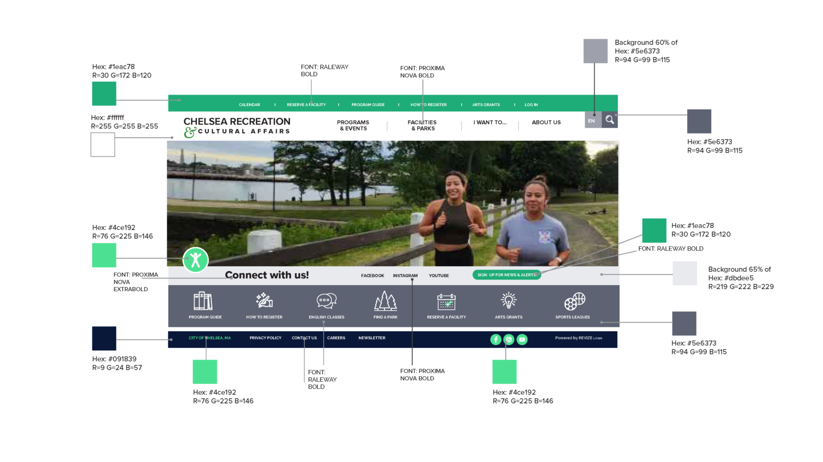
New Color Palette
for Chelsea Recreation & Cultural Affairs
Your website is the cornerstone of your marketing strategy and often serves as the first impression of your organization or company. With more individuals turning to search engines for information, it is essential to have an accessible, well-designed site featuring fresh content. Furthermore, color plays a crucial role in influencing the impact of your content and guiding the user experience.
Accessibility was a key consideration in creating equal access to information and functionality for all users. I adhered to color contrast ratio requirements for text and graphics, ensuring they are essential for understanding the content. I maintained a contrast ratio of 4.5:1 between text and background colors, making the text easy to read. Additionally, I included tools that allow users to adjust the display as needed.
A challenge I faced was the absence of a logo for Chelsea Recreation to inform the new color palette. However, green is often associated with the industry and symbolizes growth and the expansion of the department.
To complement the green, I incorporated additional colors from the city palette, including Midnight Blue and various shades of Gray. I carefully considered the emotions and attitudes associated with each color:
- Green: Growth, freshness, and healthy lifestyles
- Blue: Tranquility, confidence, and intelligence
- Black: Power and elegance
- White: Cleanliness, simplicity, and purity; it also represents modernity and honesty.
For the Upcoming Activities & Events Calendar, I applied a palette of bright and energizing colors in the backgrounds, along with an associated coding system to identify different activities.
The ultimate goal was to create a strong voice for the organization’s brand.


